Context
A financial super-app for underserved users
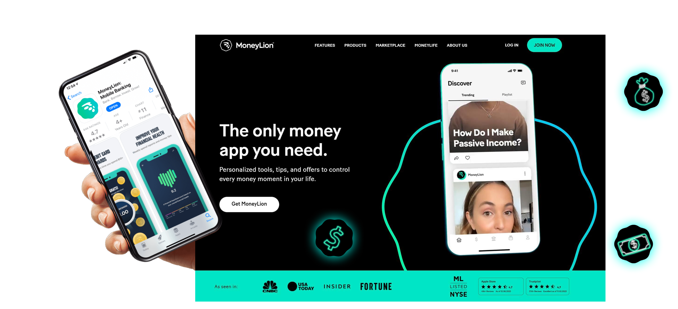
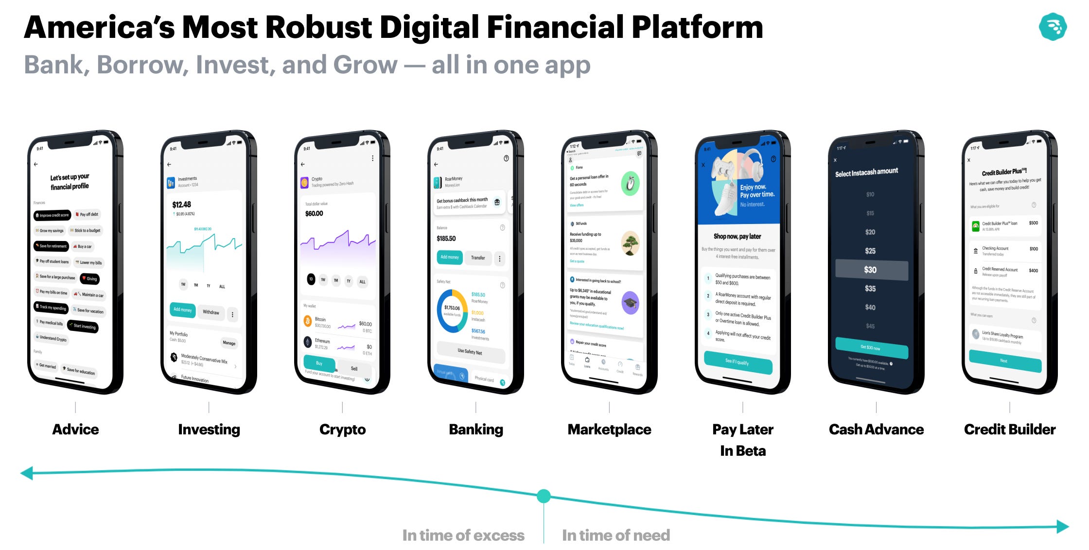
MoneyLion (NYSE: ML) bundles banking, paycheck advances, credit-building loans, and investing into a single mobile app, aimed at users underserved by traditional banking.
4.5★
Google Play
(212K reviews)
4.8★
App Store
(309K reviews)
4
Product pillars:
Borrow, Earn, Win, Save
Inside the app
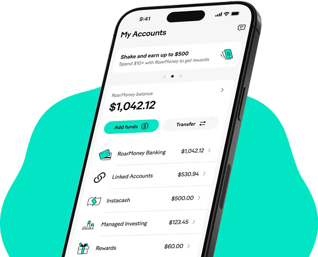
Instacash
Paycheck advances up to $500, 0% interest
RoarMoney
Digital bank account with no fees
Credit Builder
Loans that build credit history
Investing
Managed portfolios and crypto investing
Phase 1 · Discovery
The price of doing it all: information overload
I analyzed user reviews, industry comparisons, and the product's own documentation. One pattern repeats across multiple independent sources:
Too many features, one dashboard
Combining banking, loans, investing, and rewards on a single screen creates information overload and makes it hard to find what matters.
Support that's hard to reach
Users consistently report difficulty reaching customer service to resolve account or fund holds.
Monetization friction
Key features like Credit Builder Plus sit behind a $19.99/month membership, creating confusion about what's actually free.
Phase 1 · Discovery
Competitive landscape: breadth vs. focus
MoneyLion competes on breadth; its rivals compete on simplicity. That's the design opportunity.
| App | Focus | Advance | Monthly cost |
|---|
| MoneyLion | Super-app (banking + credit + investing) | Up to $500 | $0 – $19.99 |
| Dave | Simple, focused cash advance | Up to $500 | $1 |
| Brigit | Advance + credit building | Up to $250 | $9.99 |
| EarnIn | Paycheck advance, no mandatory fee | Up to $750–1000 | $0 |
Phase 2 · Define
How might we help users find what they need, without getting lost in everything the app offers?
Clear priority
One goal per screen: the user's next action should be obvious within 3 seconds.
Progressive, not all at once
Surface advanced features only once the user has mastered the basics.
Cost transparency
Make it explicit, on every screen, what's free and what requires membership.
Phase 2 · Define
Persona: the user who needs speed, not a menu
Camila, 29
Shift worker, paid biweekly
"I open the app to get an advance in 30 seconds. I don't want to compare investment portfolios right now."
Cover an unexpected expense before her next paycheck
Avoid overdraft fees
Gradually improve her credit history
Can't find the Instacash button among so many cards
Doesn't know which features she's already paying for
Takes a while to spot which screen is her main account
Phase 3 · Design
From a flat menu to an intentional hierarchy
BEFORE
Everything at the same level
Instacash
RoarMoney
Credit Builder
Investing
Crypto
Games / rewards
Insurance
Loan marketplace
AFTER
Four groups, each with a clear purpose
Today
Instacash + account status: what gets resolved in seconds
Build
Credit Builder + bureau reporting: mid-term goals
Grow
Investing and crypto: exploration, not urgency
Extra
Rewards, games, insurance: optional added value
Phase 3 · Design
Dashboard concept: one primary action, everything else available but not shouting

1
Greeting + balance
Immediate context, no prior navigation needed.
2
One card takes the spotlight
The most likely action (Instacash) occupies the space with the most visual weight.
3
Collapsed groups
Credit, investing, and "extras" are one tap away, not all on display at once.
4
A 4-icon navigation bar
Removes the 8+ option submenu from the "before" state.
Phase 3 · Design
Every feature states, unambiguously, whether it costs anything
In 2025, the CFPB flagged user confusion around memberships. The design solution: a consistent label across the whole system, not fine print at the bottom.
Standard Instacash, RoarMoney, spending tracking
Turbo fee only if the user requests instant delivery
Credit Builder Plus, extended cashback, premium card
Prototype
Through MoneyLion's account API, transaction data, and balance history, the how-to guides are matched to each user's actual account, so members see their real numbers, their exact Instacash limit, their real RoarMoney balance, their own Credit Builder progress.
Using short looping animations, interactive walkthroughs, and in-app tooltips, these guides support users across multiple functions — from requesting an Instacash advance, to setting up direct deposit on RoarMoney, to tracking payments on Credit Builder.